


OVERVIEW
As the creative lead behind District Home Magazine, I shaped the visual identity and editorial direction for a luxury home and lifestyle publication serving discerning homeowners, designers, architects, developers, and premium home brands.
While originally hired under a marketing title, the role evolved into leading the full creative execution of the publication — functioning as a hybrid Art Director, Editorial Designer, Brand Storyteller, and Creative Lead across editorial, advertising, brand partnerships, and visual merchandising narratives.
Across every issue, I translated products, interiors, and lifestyle moments into immersive visual stories designed to inspire aspiration, elevate premium brands, and connect audiences emotionally to the feeling of home.
THE CHALLENGE
Luxury home brands weren’t simply looking for ad placements — they needed editorial experiences that elevated their products beyond furniture and décor into stories, rituals, environments, and emotional lifestyle moments.
The challenge was to create a publication that felt editorially elevated and visually cohesive while balancing:
Premium home and interiors storytelling
Luxury product merchandising
Seasonal design trends and cultural relevance
Advertising performance and partner visibility
Editorial consistency across 60–100+ page issues
Multiple brand aesthetics within a single luxury visual ecosystem
Each issue required translating premium products into an experience readers wanted to step inside.
CREATIVE DIRECTION & VISUAL STORYTELLING
I developed the visual tone for the magazine from concept through final execution, shaping how luxury home, furniture, textile, and interiors brands appeared across every customer-facing touchpoint within the publication.
My work included:
Editorial Art Direction
Creating premium editorial layouts that balanced restraint, warmth, and sophistication while maintaining readability and visual hierarchy.
Seasonal & Trend-Based Storytelling
Developing visual narratives around emerging home and lifestyle trends, seasonal living, color forecasting, materials, and consumer design behavior.
Examples included:
Luxury outdoor living collections
Seasonal home styling concepts
Interior trend forecasting
Material storytelling (textiles, finishes, craftsmanship)
Heritage craftsmanship features
Renovation and lifestyle transformation stories
Product Merchandising Narratives
Transforming furniture, décor, and home products from isolated objects into aspirational lifestyle moments through curated layouts, editorial pacing, and visual storytelling.
Rather than simply showcasing products, stories were built around: how people live, gather, entertain, rest, and experience home.
Luxury Brand Translation
Collaborating with premium home, interiors, furniture, and textile brands to elevate marketing assets into editorial experiences that aligned with each brand’s unique voice while maintaining overall publication cohesion.
Featured brands included luxury and premium home companies across:
furniture
textiles
interior design
architecture
remodeling
home décor
outdoor living
CROSS-FUNCTIONAL CREATIVE LEADERSHIP
Because the publication operated like an in-house creative agency, I led nearly every aspect of production and creative execution.
Responsibilities included:
Art direction and editorial design
Creative concept development
Advertising and sponsored content design
Brand storytelling and visual positioning
Editorial planning and production management
Trend research and inspiration sourcing
Photo selection, image direction, and composition
Visual consistency across every issue
Mentoring and creative collaboration across contributors and stakeholders
The role required balancing editorial integrity, advertiser goals, audience engagement, and luxury brand positioning simultaneously.
STRATEGIC IMPACT
The magazine functioned as both a luxury lifestyle publication and a brand storytelling platform for premium home partners.
Through intentional art direction and editorial structure, the work helped:
Elevate premium home brands through editorial positioning
Increase visual consistency and perceived luxury across campaigns
Translate products into aspirational living moments
Support advertiser engagement through elevated presentation
Create cohesive seasonal visual worlds readers wanted to save, reference, and live inside
The result was a publication experience designed to feel editorial, immersive, and quietly luxurious — where design felt lived-in rather than staged.
SKILLS DEMONSTRATED
Art Direction • Editorial Design • Luxury Brand Storytelling • Seasonal Campaign Thinking • Product Merchandising • Trend Forecasting • Typography • Layout Systems • Visual Hierarchy • Home & Lifestyle Creative • Advertising Design • Brand Partnerships • Creative Leadership • Luxury Visual Positioning
FEATURED WORK
HOMMÉS STUDIO – IBIZA COLLECTION
Seasonal Campaign Concept, Product Storytelling & Lifestyle Art Direction
Concepted and designed a three-part editorial campaign around Hommés Studio’s Ibiza Outdoor Collection, strategically placed throughout the issue to repeatedly re-engage readers and reinforce brand visibility.
Rather than presenting products in a single placement, the campaign unfolded through a series of aspirational lifestyle moments — Living, Dining, and Pool — each designed to showcase the collection within a cohesive seasonal narrative centered on warmth, escape, entertaining, and elevated outdoor living.
Through intentional pacing, visual consistency, and environmental storytelling, the feature transformed product merchandising into an immersive luxury lifestyle experience while encouraging continued discovery throughout the publication.
DEDAR MILANO
Luxury Textile Storytelling & Editorial Merchandising
Created an editorial feature spotlighting luxury textile house Dedar Milano, translating intricate materiality, craftsmanship, and design heritage into an elevated visual narrative. Layout, typography, and imagery were carefully composed to turn product into aspiration — showcasing textiles not simply as materials, but as atmosphere and lifestyle.
B&B ITALIA OUTDOOR COLLECTION
Luxury Product Merchandising & Editorial World-Building
Designed a premium editorial showcase for B&B Italia’s outdoor collection, using imagery, layout, and pacing to create an immersive lifestyle experience around outdoor living. The feature emphasized mood, craftsmanship, and aspirational environments while maintaining clarity around product details and design innovation.
THOS. MOSER – 50TH ANNIVERSARY CAMPAIGN
Heritage Brand Storytelling, Product Legacy & Multi-Issue Editorial Direction
Concepted and art directed a multi-issue editorial campaign celebrating the 50th anniversary of Thos. Moser, translating the brand’s craftsmanship, heritage, and timeless design philosophy into an elevated editorial experience.
Spanning multiple issues, the campaign blended founder storytelling, product merchandising, historical timelines, and archival narrative to reinforce the emotional value of heirloom-quality furniture while maintaining a cohesive visual identity across touchpoints.
The editorial approach balanced warmth, restraint, and craftsmanship-focused storytelling — positioning products not simply as furniture, but as enduring pieces designed to be lived with and passed down over time.
YZIGN INTERIORS – “ROOM FOR TASTING”
Interior Storytelling, Environmental Narrative & Editorial Art Direction
Developed an editorial feature showcasing a custom-designed bourbon tasting room, transforming a large volume of client-supplied project photography into a cohesive and visually immersive renovation story.
Because the source imagery varied significantly in quality and composition, the challenge became curating and strategically sequencing visuals to clearly communicate the transformation while maintaining a refined editorial aesthetic. Special attention was given to selecting the strongest imagery, matching before-and-after perspectives where possible, and arranging layouts to showcase the full environment without visual clutter.
The final feature emphasized atmosphere, craftsmanship, and emotional connection to space — framing interior design as a lived experience rooted in gathering, entertaining, ritual, and storytelling rather than decoration alone.
BOCONCEPT – FALL DESIGN TRENDS
Trend Forecasting & Design-Led Consumer Content
Designed an editorial feature translating emerging seasonal home trends into approachable, design-forward inspiration for readers. By pairing product merchandising with educational storytelling, the piece bridged inspiration and commerce while reinforcing BoConcept’s modern lifestyle positioning.
ROCHE BOBOIS - MODERN TROPICALISM
Editorial Trend Storytelling, Product Curation & Visual Styling
Created a visually immersive editorial feature exploring contemporary outdoor living through the lens of Modern Tropicalism, blending curated product selections, color stories, and lifestyle inspiration into a cohesive design narrative.
Because the featured furniture relied heavily on bold tropical patterns and statement textures, the primary creative challenge became balancing visual energy with editorial restraint. Careful consideration was given to image pairing, color hierarchy, and layout composition to ensure elements complemented rather than competed with one another — avoiding visual clutter while maintaining a premium, contemporary feel.
The final feature balanced trend forecasting with product merchandising, transforming statement furniture into an aspirational lifestyle story that felt elevated, intentional, and visually harmonious.
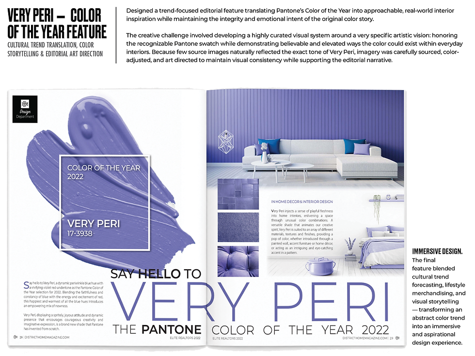
VERY PERI – COLOR OF THE YEAR FEATURE
Cultural Trend Translation, Color Storytelling & Editorial Art Direction
Designed a trend-focused editorial feature translating Pantone’s Color of the Year into approachable, real-world interior inspiration while maintaining the integrity and emotional intent of the original color story.
The creative challenge involved developing a highly curated visual system around a very specific artistic vision: honoring the recognizable Pantone swatch while demonstrating believable and elevated ways the color could exist within everyday interiors. Because few source images naturally reflected the exact tone of Very Peri, imagery was carefully sourced, color-adjusted, and art directed to maintain visual consistency while supporting the editorial narrative.
The final feature blended cultural trend forecasting, lifestyle merchandising, and visual storytelling — transforming an abstract color trend into an immersive and aspirational design experience.