


DISTRICT HOME MAGAZINE —
REAL ESTATE MARKETING
Brand-Building for DC's Top Agents and Brokerages
Real estate is the backbone of District Home's advertiser base — but agents and brokerages weren't buying page space. They were buying a brand relationship. Every agent who advertised with District Home needed marketing that did two things at once: sell the property in front of them, and build the personal brand that would sell the next ten.


As Creative & Brand Director/Editor & Art Director (masthead), I built that marketing for the publication's top-performing agents and brokerages — moving beyond one-off listing design into ongoing brand systems that grew with each client relationship.
JOHN MENTIS: A BRAND EVOLUTION, BEFORE AND DURING
John Mentis is the clearest proof of what sustained creative partnership can do for an agent's brand. This wasn't a single deliverable — it grew into a full-channel brand system, with the same creative direction running across:
Video — brand and property video content
Website — ongoing updates to his site
Animated logo — evolving his motion mark over time
Agent collateral — business cards, open house signage, and yard signs
Social media — recurring post production
Across the working relationship, his marketing moved through a visible evolution:
Before — Standard listing collateral: functional, transactional, indistinguishable from the rest of the market.
During — A deliberate shift toward editorial-quality storytelling, extended across every channel above. Property features were built to read like magazine content rather than flyers, positioning Mentis as a lifestyle authority in his market rather than just an agent moving inventory — and that positioning was reinforced consistently whether someone encountered him in print, on his website, at an open house, or in his social feed.
What made the During period different wasn't any single piece — it was consistency across every channel at once. Video, website, motion, social, and print collateral all carried the same creative direction simultaneously, reinforcing one brand identity no matter where a client encountered Mentis. That kind of system only exists through sustained creative direction — it's the difference between strong individual pieces and a brand that behaves the same way everywhere.
LISTING AD PRODUCTION: MAKING VOLUME LOOK LIKE CRAFT
Beneath the featured client relationships was a steady production reality: every issue required a run of individual real estate listing ads — often ten or more per cycle, all built to the same format and size, all needing to feel distinct rather than templated.

That meant treating each one as its own small brand exercise rather than a mail-merge. Every ad had to reflect the individual agent it represented, not just the property — which meant sourcing headshots, logos, and property photography for each realtor, often with inconsistent or missing assets. When an agent didn't have a usable logo, I built one — an unofficial mark good enough to hold its own on the page, matched to their existing visual presence.
The real skill wasn't any single ad. It was running that process ten-plus times a cycle without any of them reading as assembly-line work, while still meeting production deadlines that didn't move.
COVER DESIGN: THE HIGHEST-VISIBILITY PLACEMENT
Beyond interior ad pages, cover placement was the top tier of the real estate marketing product — priced in the media kit as a premium package precisely because it was the single most visible spot in every issue. The range of covers built for agents and brokerages shows that the premium placement wasn't a single template:
Agent portrait covers — direct, personality-forward placements built around a single realtor as the story (Trish Dunn, "Meet Top Producer," pairing her production credentials with a client testimonial pull-quote; Leah Anderson Group; Lee Ann Wilkinson's Elite Realtors 2023 cover, tying together a personal profile, a Q&A feature, and a Next Neighborhood tie-in on one cover)
Property/estate covers — the listing itself as the hero, with the agent credited rather than pictured (a bespoke log estate in Rileyville, VA for Lorraine Barclay Nordlinger of TTR Sotheby's)
Sponsor partnership covers — built around an announced business relationship rather than a single agent or property (the Jessica Zweig x Long & Foster "Power Couple of 2022" cover for the Elite Realtors annual issue, visually establishing the SimplyBe. x Long & Foster partnership before a reader ever opened the issue)
Team/brand feature covers — built around a group or company story rather than a single agent (Jill Schwartz's first cover, "An Inside Look at the Creators of LuxeHouzz.com," featuring The Floridian Group team)
Event promotion covers — a cover built to drive attendance to a real-world event rather than showcase a listing (Jill Schwartz's second cover, promoting the Kim Cohen art show — see her full cover arc below)

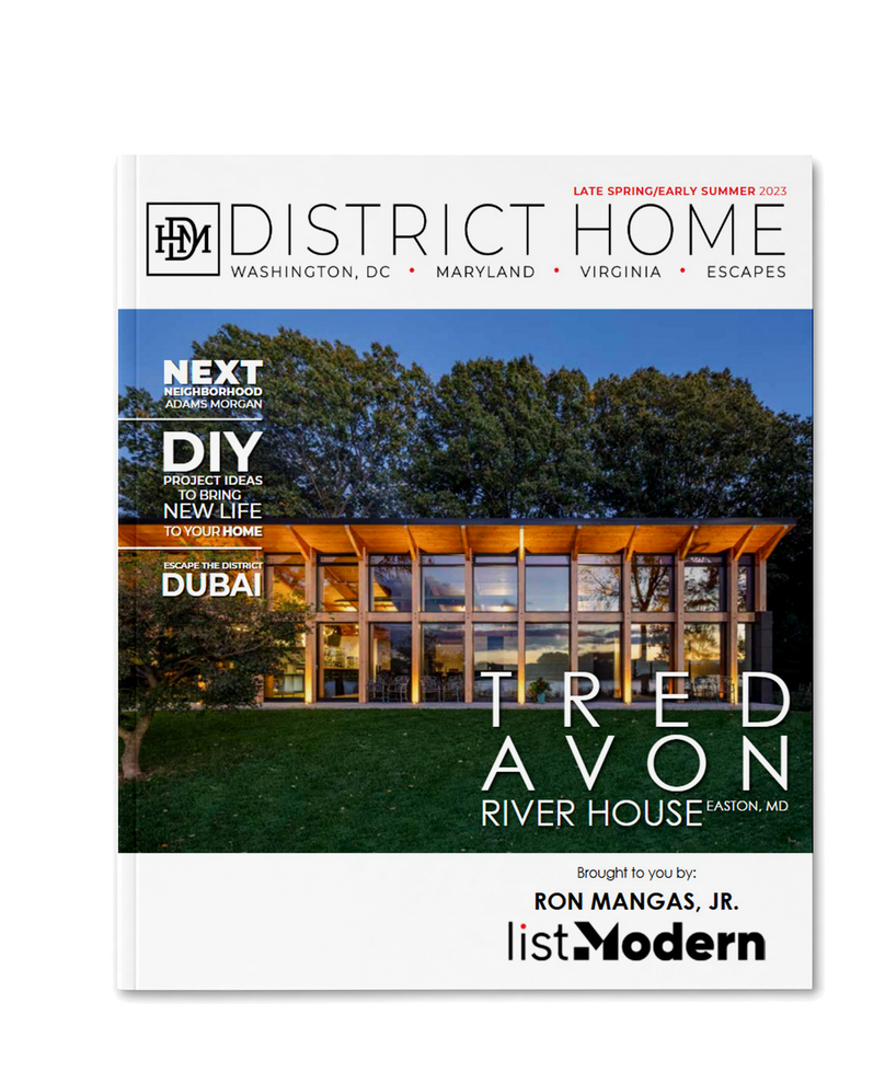


Each cover type required a different design logic — portrait-led personal branding, architectural hero photography, partnership storytelling, or event promotion — while still reading as unmistakably District Home on the newsstand or in a mailbox.
LEAH ANDERSON GROUP: FROM EDITORIAL FEATURE TO FULL BRAND SYSTEM
The Leah Anderson Group relationship started as a cover and a single editorial placement and expanded into a complete brand identity system — the same scope-expansion pattern that shows up across this body of work. What began as one piece of content became an ongoing brand relationship, with materials built to function together rather than as one-off assets.

TAYLOR AGOSTINO GROUP: CAMPAIGNS AT A WEEKLY CADENCE
Taylor Agostino Group required a different kind of discipline: recurring campaign work paired with a steady weekly social cadence. This wasn't about a single hero deliverable — it was about building a system that could produce consistent, on-brand output on a predictable schedule without the quality dropping off between cycles.
NANCY TAYLOR BUBES: A RECURRING, MULTI-FORMAT RELATIONSHIP
Nancy Taylor Bubes's account ran on its own recurring rhythm: a bi-weekly postcard, individual property listing ads, and a full directory book. Three distinct formats, each with its own production cadence, all needing to feel like they came from the same hand — which meant building a system flexible enough to hold up across a quick-turn postcard and a long-lead directory publication alike.
JILL SCHWARTZ: COVER PLACEMENT AND MULTI-AD SUPPORT
Jill Schwartz's presence extended beyond a single placement, combining premium cover exposure with property storytelling, event promotion, and ongoing team advertising across multiple issues. The system kept her brand recognizable from piece to piece while allowing each placement to solve a different communication need.

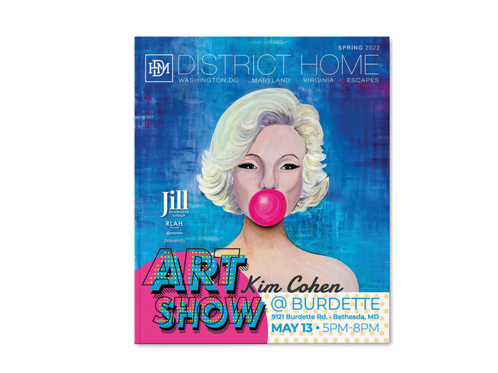



One client. Multiple objectives. One recognizable presence.
LONG & FOSTER: THE INSTITUTIONAL COUNTERPOINT
Where the agent-level work was personal and editorial, Long & Foster called for institutional and brokerage-level brand execution — a large-scale storefront window installation spanning multiple bays, event branding, and agent award materials. This is the coda to the section: proof that the same creative direction scaled from an individual agent’s personal brand to brokerage-wide environmental and brand applications.






EDITORIAL STORYTELLING: Q&A FEATURES
Running alongside the direct client work, a recurring Q&A feature format gave agents an editorial platform inside the magazine itself — turning real estate marketing into content readers would seek out, rather than advertising they'd simply scroll past.
The format maintained a recognizable editorial structure while flexing visually around each agent's personality, photography, and brand — creating consistency across the publication without reducing the series to a template.

STRATEGIC IMPACT
Across five agent relationships, one brokerage-level partnership, property listing ads, premium cover placements, and a recurring editorial format, the throughline is the same: real estate marketing at District Home wasn't listing design. It was brand-building — personal brand for individual agents, institutional brand for brokerages, and editorial credibility for both. Each relationship followed its own version of the same pattern: what started as a single deliverable became an ongoing system.
SKILLS DEMONSTRATED
Real Estate Marketing • Personal Brand Development • Brand Evolution Strategy • Institutional Brand Systems • Environmental & Event Branding • Editorial Storytelling • Client Relationship Growth • Recurring Campaign Production • Ad Production at Scale • Asset Sourcing & Logo Development • Motion Graphics & Animated Logo Design • Video Production • Website Maintenance • Print Collateral Design • Magazine Cover Design • Partnership & Sponsor Storytelling • Event Promotion Design