


DISTRICT HOME MAGAZINE —
ADVERTORIAL & BRANDED CONTENT
Branded Storytelling That Served Advertisers Without Compromising the Brand
Not every page in District Home was built around a single client relationship. A meaningful part of the magazine's identity lived in its recurring departments — branded sections that ran issue after issue, each with its own visual system, giving readers a consistent way to navigate the magazine while giving advertisers and content partners a reliable, on-brand home for their material.


BUILDING ONE ICON SYSTEM OUT OF FIVE
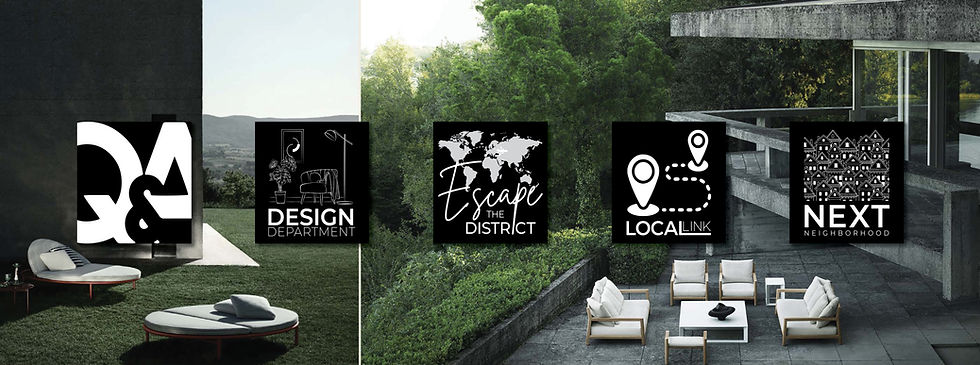
When I stepped into the role, the department icons — the small badge marks that opened each recurring section — were inconsistent: boxy, visually disconnected from one another, and incomplete, with some departments carrying no real mark at all. Readers moving between sections had no visual cue that they were still inside the same magazine's design language.
I redesigned the department icon system from the ground up, unifying it into one cohesive family and extending it to cover every recurring section, including ones that hadn't had a proper mark before:
Local Link — local destination and culture features (walking tours, museums, festivals)
Next Neighborhood — neighborhood profiles and real estate–adjacent lifestyle content
Design Department — home design trends, renovation guidance, and product features
Escape the District — travel content, positioned as an aspirational counterpoint to home-focused coverage
A fifth department icon, Q&A, is part of this same visual system but is covered in the Real Estate Marketing companion case study, where it functions as the recurring agent editorial format.
What had been a set of disconnected marks became a recognizable system readers could navigate by — the kind of small, structural brand decision that doesn't show up in any single page, but holds the whole publication together issue to issue.

CONTENT: SOURCED, ADAPTED, AND ORIGINAL
The department pages weren't purely a design exercise. Some content was sourced from syndication services and adapted — edited, retitled, and laid out to match the magazine's voice and visual system. Other pieces were compiled or written outright. Across both, the job was the same: make every page read as if it belonged to District Home, regardless of where the raw content originated.
ONE-OFF VENDOR FEATURES: LUXURY PRODUCT SPREADS
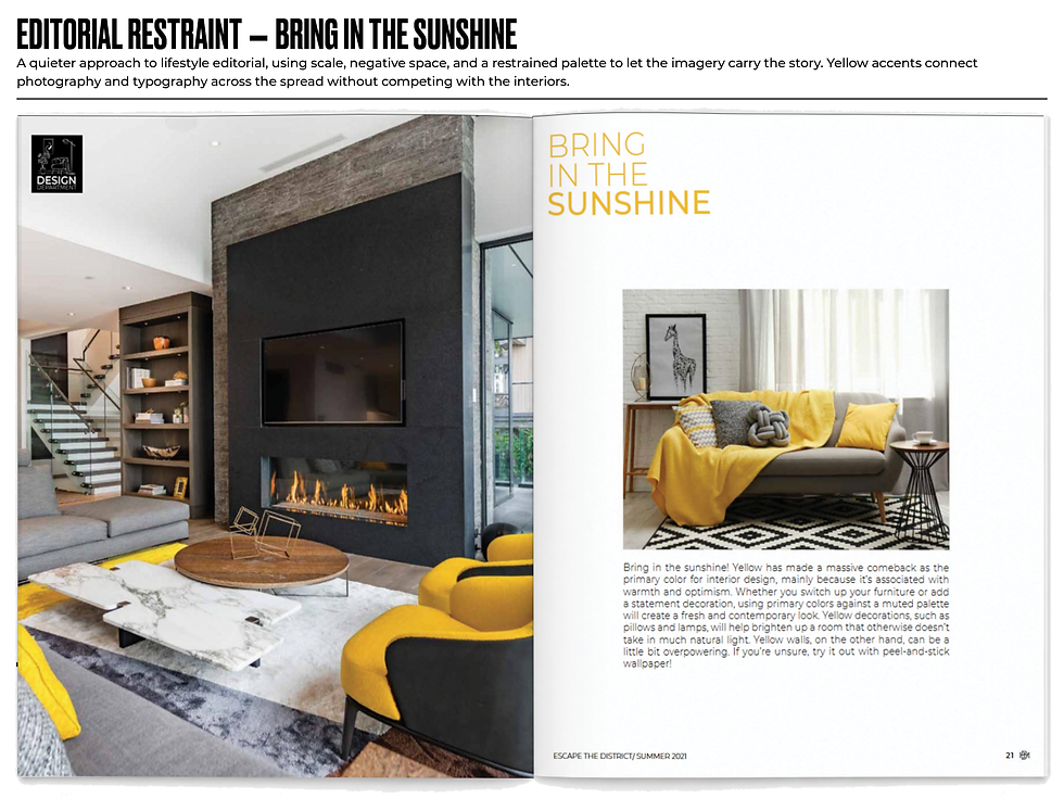
Beyond the recurring departments, the annual Elite Realtors issue carried standalone advertorial spreads for individual luxury vendors — full-page features built around a single brand's product line, styled to read as design editorial rather than a straight advertisement, produced fresh each year. Examples include:
B&B Italia Outdoor — a multi-page feature on the brand's 2022 outdoor collection, including the Borea sunbed and Pablo Outdoor seating lines, with designer quotes and material detail
Dedar Milano — a fabric house feature built around a single textile story ("Reginaldo"), pairing lifestyle photography with product close-ups
ACH Collection by Hommés Studio — an "Eclectic Soul" living-area feature built around the brand's Shadow Play capsule collection
Each of these required matching an outside brand's existing visual identity and product photography to the magazine's own layout language — different from the department system, where the visual identity was mine to build from scratch.
Note: B&B Italia Outdoor and Dedar Milano also appear in the Luxury Lifestyle Editorial companion case study, framed there as product merchandising and craftsmanship storytelling rather than advertiser relationship work. Same features, different lens — this section focuses on the sponsored-content mechanics; that one focuses on the editorial craft.
SPONSORED THOUGHT LEADERSHIP: SIMPLYBE. x LONG & FOSTER
A different kind of advertorial ran in the same annual issue: "An Authentic Personal Brand," a bylined feature from Jessica Zweig, CEO of personal branding firm SimplyBe., announcing their partnership with Long & Foster. Unlike the vendor product spreads, this was written thought-leadership content with an author bio and outside photography — the design task was building a feature layout substantial enough to carry a named author and a partnership announcement with real editorial weight, not just product images.

STRATEGIC IMPACT
Advertorial and branded content at District Home ran across a wide spectrum — from a unified icon system holding four recurring departments together, to syndicated content adapted into the magazine's voice, to annual luxury vendor spreads, to sponsor-written thought leadership carrying a named byline. Each format demanded a different balance of design and editorial judgment, but the standard was the same throughout: every page had to feel like it belonged in District Home, whether the words on it were mine, adapted, or someone else's entirely.
SKILLS DEMONSTRATED
Brand System Design • Icon & Mark Development • Editorial Adaptation • Content Sourcing & Curation • Advertorial Layout • Vendor Brand Matching • Sponsored Content Production • Annual Special Issue Production